How I made my web pages load 10x faster
Update: As of 17th June, 2024, I have also started using font-awesome and google-fonts which goes directly against my principle of “no-cruft”! And while the point of this article still stands in theory, I came to learn that there are pragmatic limits to how far you can stretch minimalism. At some point, utilitarianism starts overriding minimalism.
Update: As of 1st November, 2023, I have switched to the default Jekyll site generator from Pelican as I found the deployment and Github Pages workflow easier. However, the point of this article still stands.
The most typical advice you get when it comes to improving site performance these days is purely technical things like using CDNs or other serving optimization, using X hosting mechanism instead of Y, going serverless, cache optimization, etc.
I’m not talking about those things, I’m talking about the old school millennial way of optimizing things which is by reducing clutter and subscribing to the ideals of minimalism and common sense!
The way our websites look and perform reflects our mindset in some ways, all that clutter and clunkiness that could be easily avoided still makes it to the web design for God knows what reason and keeps clogging our network bandwidth.

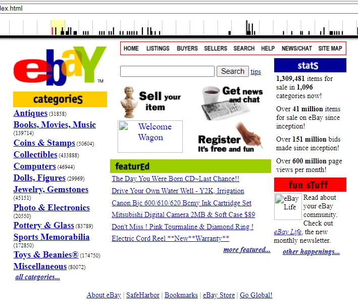
“It’s too bland and simple Prahlad, it doesn’t look professional enough”, they keep saying. Unfortunately, most of us have been trained to appreciate complex and clunky solutions in life instead of simple ones! This simple and bland looking eBay website from late 1990s, for example, allowed you to do a bunch of useful things with way more efficiency than today’s equivalents. From allowing a user to register and login to adding items to a shopping cart to processing the payment by directing the user to a gateway and then bringing them back to the “thank you” page - more utility, less clunkiness.

Today’s apps also do the exact same thing but they require 10x more resources due to all the bloat and clunkiness across the development stack. We need a hundred different npm packages for transpilers, minifiers, compressors, etc. and still the end result is clunkiness in user experience. The websites of 1990s used to run on a server with 32 megabyte RAM chip and powered by an Intel 486 processor!
An attitude of simplicity and minimalism is the urgent need of the hour in both our society and IT systems. Once you start questioning your confused and complicated stack with, “Do I really need this X layer or Y framework or Z library?”, you’ll find that the answer you’ll get is “NO” in most of the cases.
A few years back when this minimalism thing stuck me, I decided that I will de-clutter my website as much as possible. The first thing I did was to get rid of the free shared hosting and migrated my site from a wordpress.org instance to a statically hosted github pages site. Some time after that, somewhere around the pandemic period, I decided to get rid of my domain name too. Why waste INR 1,000 each year when github.io provides me a subdomain which is sufficient for almost every use case I can think of as a freelance programmer.
This is the kind of minimalist attitude we must bring in our lives. Imagine if a corporate IT or MNC firm decides to use its resources with such efficiency, imagine the kind of savings it’d make. All those savings can be used to pay off their engineers who are getting laid off and retain them instead of spending on costly AWS services which sustain that clunkiness!
If you think that even after switching from WP to a statically hosted site, was it even possible to bring even more minimalism to a website, then the answer is a resounding YES! Below are some measures which I took (and still taking as it’s a work in progress) for this:
Get rid of front-end frameworks like bootstrap and material-ui, write your own CSS/JS.
Whether it’s old school stacks like jquery/bootstrap or more modernish ones like react/material-ui, they all add some clutter and clunkiness to your site. People today have somehow got this toxic and pathological belief that each and every website or app must absolutely use these frameworks and libraries in order to look professional. I have nothing against these tools but it’s quite apparent that they aren’t needed for all use cases. A statically hosted blog such as this one is a perfect example.
If you are building a large ecommerce site or something, it could be justified but even there, you should ask yourself why you need a tool before just implementing (consider the eBay site from 1990s example).
Thus, bootstrap and jquery were the things I got rid of as I didn’t need them.
Use UNICODE emojis instead of icon libraries like font-awesome.
A clunky icon or image library doesn’t need to be downloaded each time if all you need is to display some symbols. The Unicode standard has evolved enough by now so that most symbols and emojis are part of the standard and available on all devices. As you can see on my about page, I’ve used emojis like books 📗, tools 🛠, pointing finger 👉 and even hour-glass ⌛ to convey my point across. You don’t need any icon or image library for this.
Resize/Compress your images and resources.
Do you even need that hi-resolution and thousands of pixels wide image which occupies triple digit MBs on the hard disk? In most cases, you don’t. In most cases, you specifically control the “width” or “height” attribute of <img> elements which usually need to be much smaller than their actual size. But the entire image is still downloaded to the client browser each time. Better idea is to just compress the image using a software like GIMP or Paintbrush by reducing its dimensions and that’s it.
I haven’t gotten around minifying my CSS and JS yet because the site’s average load is hardly ~500KB as it is. But guess I’d be able to shave off some more on that once I implement this in the tool chain.
Convert your PNGs and JPEGs to WEBPs.
This thing is still a work in progress but I’ve started converting my site’s PNGs and JPEGs to WEBP format. On average, WEBP lossless images are 26% smaller in size compared to PNG. These savings mean gigantic potential efficiency in terms of less bandwidth utilization and resource consumption over the lifetime of a website! It’s a wonder why we are still stuck using PNGs and JPEGs at all and the web hasn’t already moved to WEBPs entirely yet!
It’s all about minimalism attitude and mindset.
Think why is it that sites like Hacker News, Tildes, Lobsters, etc. are getting so popular among the nerds and intellectuals of this society. Think why is Old Reddit still up and running despite them trying everything under the sun to publicize the new and clunky version when it came! When Wikipedia tried the clunkiness way some time back, the Internet soon start filling up with help posts like these for switching back to the old Vector theme. The world needs to understand that minimalism is the future, there just aren’t enough resources in this world to sustain the clunkiness anymore.
Internet bandwidth also isn’t an abundant resource. It tended to be cheap ever since the data revolution began about a decade ago but that may not be the case always. ISPs across the world are already tightening the screws on this, they are gradually increasing the data cost. Jio and Airtel recharges are much pricier today than they were a year ago. Once that starts happening, your cloud services will need to bring more efficiency and performance instead of more features in order to stay profitable, better start preparing for that day today itself instead of waiting for that day!
And don’t fall for the wrongful narratives and agendas of those who keep justifying the clunkiness as part of their business model. Merchants of complexity will always keep building their Death Stars because it’s their job as a business or corporate to think about their interest. But at the same time, it’s our job to not get distracted by it and stay minimal which is both in our and society’s best interest.
In conclusion, this famous quote by MK Gandhi perhaps applies more in today’s world than it did in 1947:
The world has enough for everyone’s needs, but not everyone’s greed.